A storytelling and data visualization agency
Our mission is to make research beautiful. To give "data" color, a story, a voice that moves people to act.
We work with the world's leading research agencies, NGOs, and consulting firms to bring their data to life.
Established
years
Work with
clients
Created
projects
Projects
Sharing meaningful, data-driven stories through white papers, video, social, infographics, and interactive visualizations.
Services
Reimagining research through bold ideas and innovative deliverables that tell powerful stories.
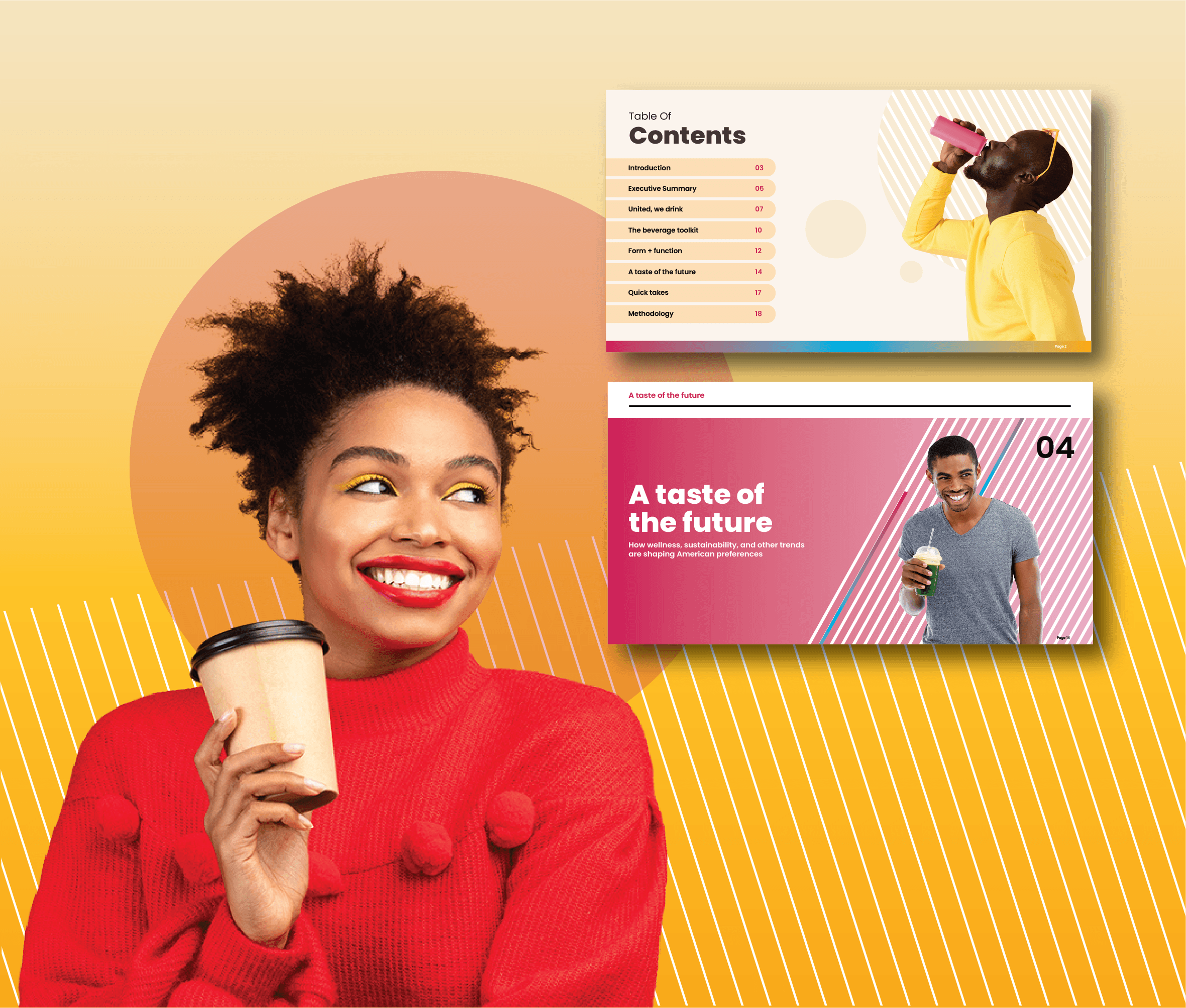
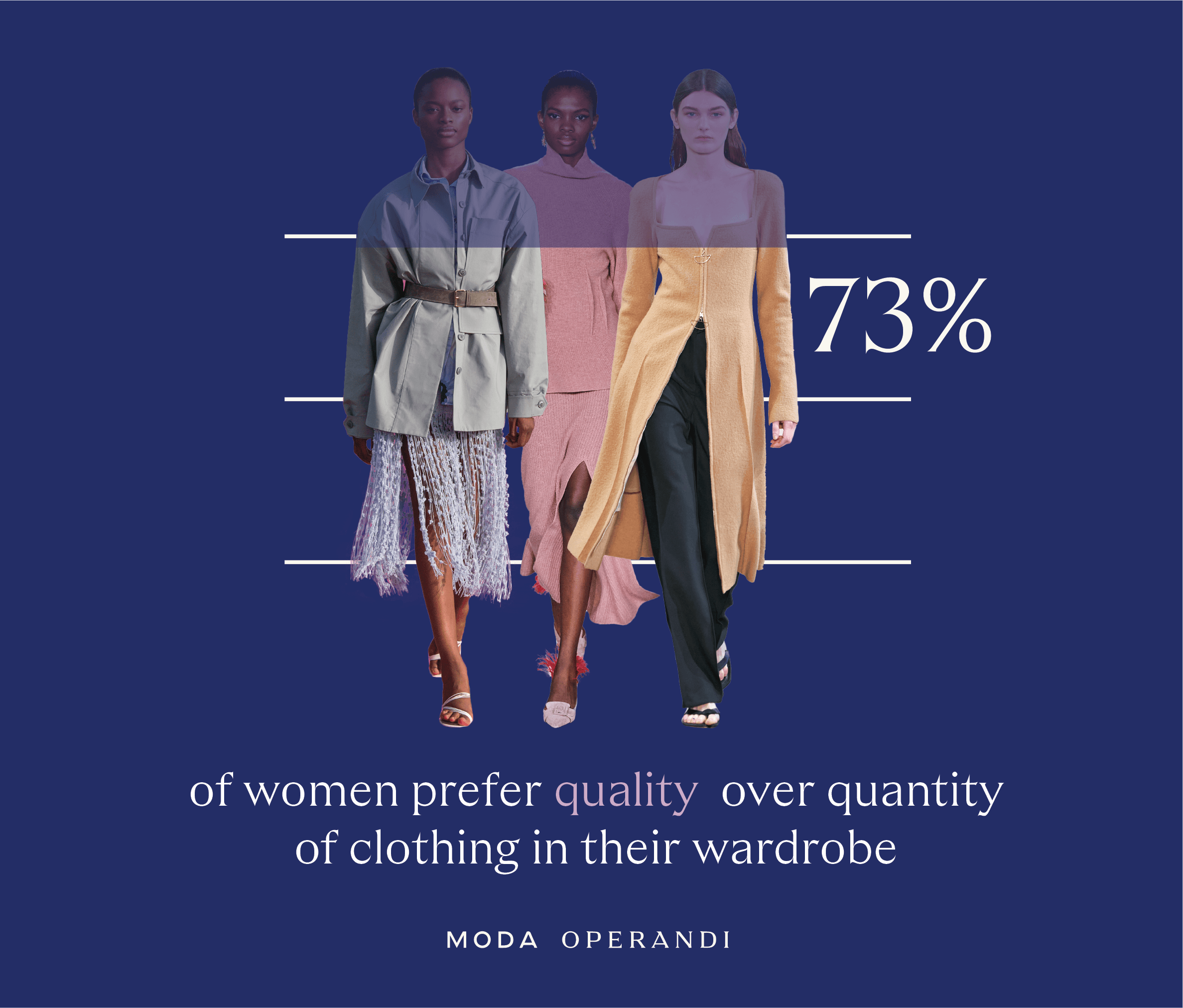
Infographics & White Papers
See more
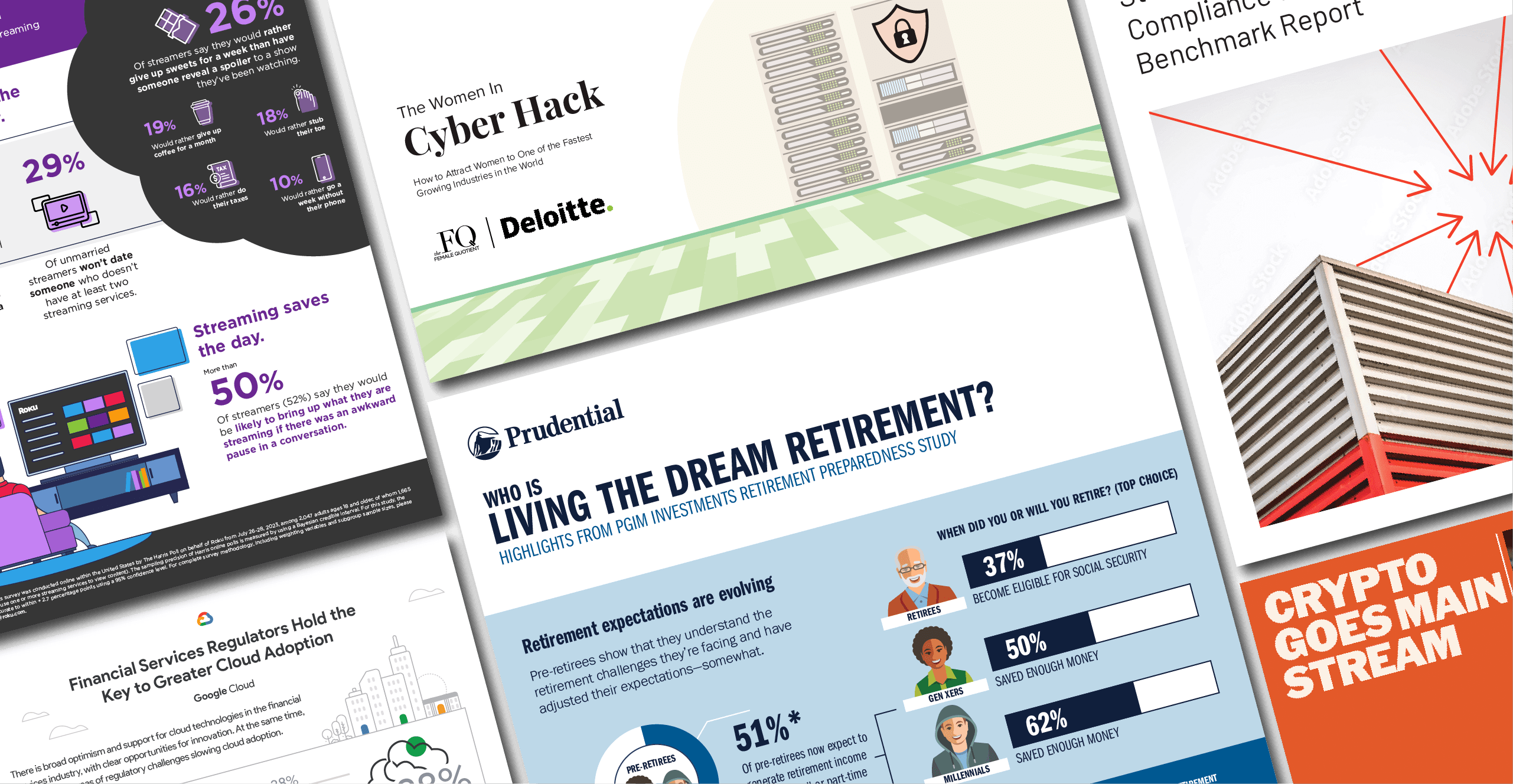
Simple & Clear
We transform complex research findings into storytelling tools that are both visually engaging and intellectually meaningful. By combining the clarity of infographics with the depth of white papers, we help audiences understand data and connect with it.
Video & Animation
See more
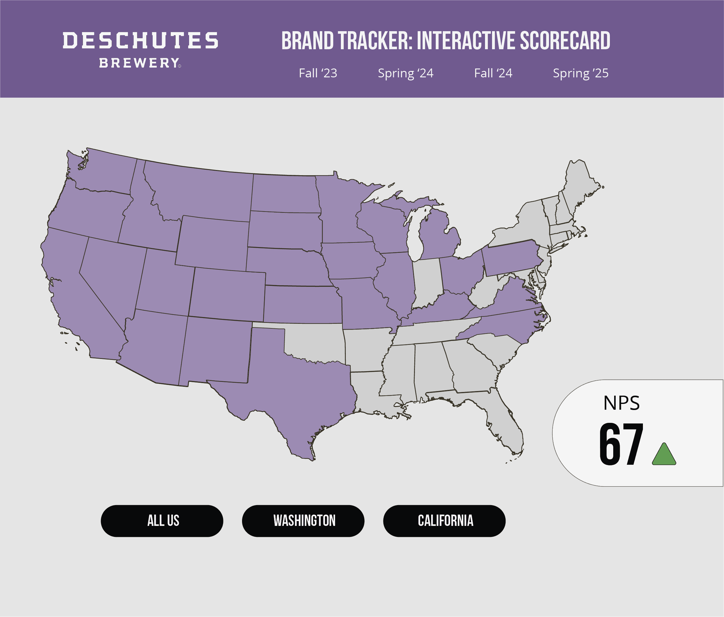
Interactive & Automation
See more
Live Events
See more
Infographics & White Papers
See more
Video & Animation
See more
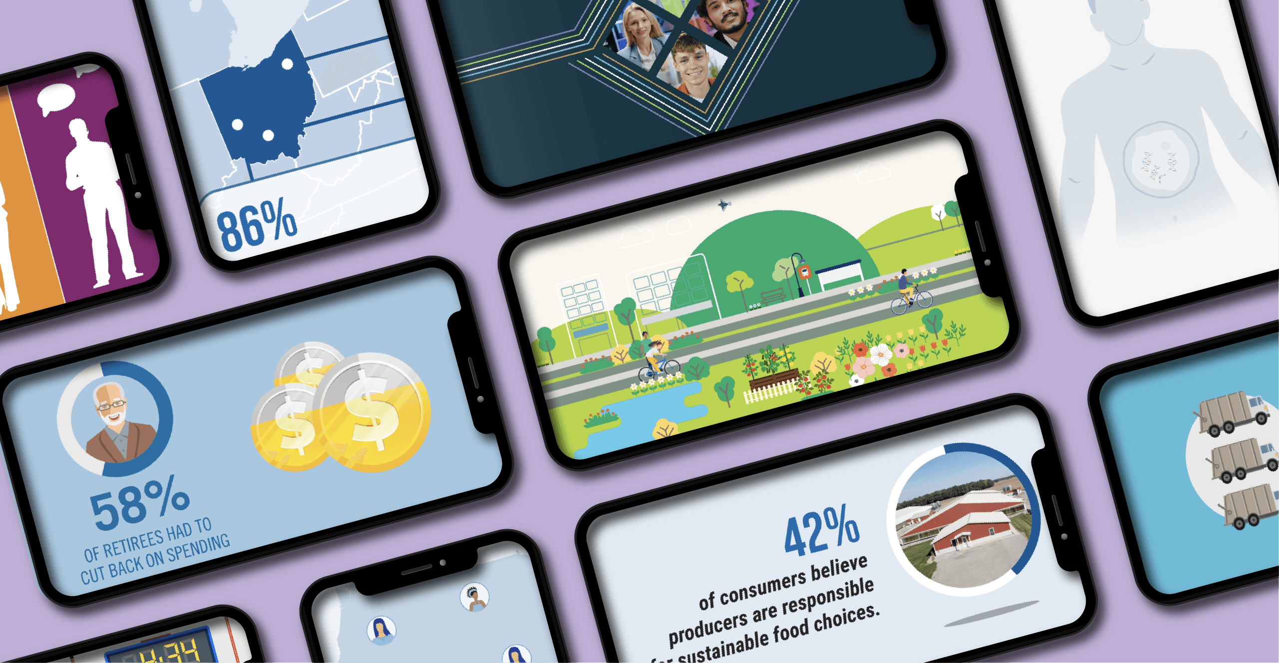
Engaging & Impactful
By blending animation and video, we create data-driven content that captures attention, simplifies complexity, and leaves a lasting impression. Our video options are ideal for for non-research audiences and executive teams who quickly need to synthesize the major points of a research project.
Interactive & Automation
See more
Live Events
See more
Infographics & White Papers
See more
Video & Animation
See more

Engaging & Impactful
By blending animation and video, we create data-driven content that captures attention, simplifies complexity, and leaves a lasting impression. Our video options are ideal for for non-research audiences and executive teams who quickly need to synthesize the major points of a research project.
Interactive & Automation
See more
Live Events
See more
We create visualizations that grab attention and elevate insights, transforming the way organizations make decisions.
“They have an exceptional ability to help us synthesize a range of data points into a beautiful and coherent story that decision makers can understand and act on. Put another way, they are experts at helping turn data pattern into business story. They are easy to work with, and the final product is visually compelling!”

Bob Moran
Brunswick Group
"VisibleMR's visualization elevates both the work itself and end-user engagement, making the research more approachable and ensuring it's acted upon. Their ability to 'speak' research has saved countless hours, and their willingness to co-collaborate has helped each and every output sing."

Rocky Prozeller
Old Salt
“By automating our reporting, they freed our team to focus on insight instead of execution. Reports that used to take days are now delivered automatically and with greater accuracy.”

Dany Galbiati
Harris Poll
“They have an exceptional ability to help us synthesize a range of data points into a beautiful and coherent story that decision makers can understand and act on. Put another way, they are experts at helping turn data pattern into business story. They are easy to work with, and the final product is visually compelling!”

Bob Moran
Brunswick Group
"VisibleMR's visualization elevates both the work itself and end-user engagement, making the research more approachable and ensuring it's acted upon. Their ability to 'speak' research has saved countless hours, and their willingness to co-collaborate has helped each and every output sing."

Rocky Prozeller
Old Salt
“By automating our reporting, they freed our team to focus on insight instead of execution. Reports that used to take days are now delivered automatically and with greater accuracy.”

Dany Galbiati
Harris Poll
“They have an exceptional ability to help us synthesize a range of data points into a beautiful and coherent story that decision makers can understand and act on. Put another way, they are experts at helping turn data pattern into business story. They are easy to work with, and the final product is visually compelling!”

Bob Moran
Brunswick Group
"VisibleMR's visualization elevates both the work itself and end-user engagement, making the research more approachable and ensuring it's acted upon. Their ability to 'speak' research has saved countless hours, and their willingness to co-collaborate has helped each and every output sing."

Rocky Prozeller
Old Salt
“By automating our reporting, they freed our team to focus on insight instead of execution. Reports that used to take days are now delivered automatically and with greater accuracy.”

Dany Galbiati
Harris Poll
“They have an exceptional ability to help us synthesize a range of data points into a beautiful and coherent story that decision makers can understand and act on. Put another way, they are experts at helping turn data pattern into business story. They are easy to work with, and the final product is visually compelling!”

Bob Moran
Brunswick Group
"VisibleMR's visualization elevates both the work itself and end-user engagement, making the research more approachable and ensuring it's acted upon. Their ability to 'speak' research has saved countless hours, and their willingness to co-collaborate has helped each and every output sing."

Rocky Prozeller
Old Salt
“By automating our reporting, they freed our team to focus on insight instead of execution. Reports that used to take days are now delivered automatically and with greater accuracy.”

Dany Galbiati
Harris Poll
“They have an exceptional ability to help us synthesize a range of data points into a beautiful and coherent story that decision makers can understand and act on. Put another way, they are experts at helping turn data pattern into business story. They are easy to work with, and the final product is visually compelling!”

Bob Moran
Brunswick Group
"VisibleMR's visualization elevates both the work itself and end-user engagement, making the research more approachable and ensuring it's acted upon. Their ability to 'speak' research has saved countless hours, and their willingness to co-collaborate has helped each and every output sing."

Rocky Prozeller
Old Salt
“By automating our reporting, they freed our team to focus on insight instead of execution. Reports that used to take days are now delivered automatically and with greater accuracy.”

Dany Galbiati
Harris Poll
“They have an exceptional ability to help us synthesize a range of data points into a beautiful and coherent story that decision makers can understand and act on. Put another way, they are experts at helping turn data pattern into business story. They are easy to work with, and the final product is visually compelling!”

Bob Moran
Brunswick Group
"VisibleMR's visualization elevates both the work itself and end-user engagement, making the research more approachable and ensuring it's acted upon. Their ability to 'speak' research has saved countless hours, and their willingness to co-collaborate has helped each and every output sing."

Rocky Prozeller
Old Salt
“By automating our reporting, they freed our team to focus on insight instead of execution. Reports that used to take days are now delivered automatically and with greater accuracy.”

Dany Galbiati
Harris Poll
“They have an exceptional ability to help us synthesize a range of data points into a beautiful and coherent story that decision makers can understand and act on. Put another way, they are experts at helping turn data pattern into business story. They are easy to work with, and the final product is visually compelling!”

Bob Moran
Brunswick Group
"VisibleMR's visualization elevates both the work itself and end-user engagement, making the research more approachable and ensuring it's acted upon. Their ability to 'speak' research has saved countless hours, and their willingness to co-collaborate has helped each and every output sing."

Rocky Prozeller
Old Salt
“By automating our reporting, they freed our team to focus on insight instead of execution. Reports that used to take days are now delivered automatically and with greater accuracy.”

Dany Galbiati
Harris Poll
“They have an exceptional ability to help us synthesize a range of data points into a beautiful and coherent story that decision makers can understand and act on. Put another way, they are experts at helping turn data pattern into business story. They are easy to work with, and the final product is visually compelling!”

Bob Moran
Brunswick Group
"VisibleMR's visualization elevates both the work itself and end-user engagement, making the research more approachable and ensuring it's acted upon. Their ability to 'speak' research has saved countless hours, and their willingness to co-collaborate has helped each and every output sing."

Rocky Prozeller
Old Salt
“By automating our reporting, they freed our team to focus on insight instead of execution. Reports that used to take days are now delivered automatically and with greater accuracy.”

Dany Galbiati
Harris Poll
“They have an exceptional ability to help us synthesize a range of data points into a beautiful and coherent story that decision makers can understand and act on. Put another way, they are experts at helping turn data pattern into business story. They are easy to work with, and the final product is visually compelling!”

Bob Moran
Brunswick Group
"VisibleMR's visualization elevates both the work itself and end-user engagement, making the research more approachable and ensuring it's acted upon. Their ability to 'speak' research has saved countless hours, and their willingness to co-collaborate has helped each and every output sing."

Rocky Prozeller
Old Salt
“By automating our reporting, they freed our team to focus on insight instead of execution. Reports that used to take days are now delivered automatically and with greater accuracy.”

Dany Galbiati
Harris Poll
“They have an exceptional ability to help us synthesize a range of data points into a beautiful and coherent story that decision makers can understand and act on. Put another way, they are experts at helping turn data pattern into business story. They are easy to work with, and the final product is visually compelling!”

Bob Moran
Brunswick Group
"VisibleMR's visualization elevates both the work itself and end-user engagement, making the research more approachable and ensuring it's acted upon. Their ability to 'speak' research has saved countless hours, and their willingness to co-collaborate has helped each and every output sing."

Rocky Prozeller
Old Salt
“By automating our reporting, they freed our team to focus on insight instead of execution. Reports that used to take days are now delivered automatically and with greater accuracy.”

Dany Galbiati
Harris Poll
“They have an exceptional ability to help us synthesize a range of data points into a beautiful and coherent story that decision makers can understand and act on. Put another way, they are experts at helping turn data pattern into business story. They are easy to work with, and the final product is visually compelling!”

Bob Moran
Brunswick Group
"VisibleMR's visualization elevates both the work itself and end-user engagement, making the research more approachable and ensuring it's acted upon. Their ability to 'speak' research has saved countless hours, and their willingness to co-collaborate has helped each and every output sing."

Rocky Prozeller
Old Salt
“By automating our reporting, they freed our team to focus on insight instead of execution. Reports that used to take days are now delivered automatically and with greater accuracy.”

Dany Galbiati
Harris Poll
“They have an exceptional ability to help us synthesize a range of data points into a beautiful and coherent story that decision makers can understand and act on. Put another way, they are experts at helping turn data pattern into business story. They are easy to work with, and the final product is visually compelling!”

Bob Moran
Brunswick Group
"VisibleMR's visualization elevates both the work itself and end-user engagement, making the research more approachable and ensuring it's acted upon. Their ability to 'speak' research has saved countless hours, and their willingness to co-collaborate has helped each and every output sing."

Rocky Prozeller
Old Salt
“By automating our reporting, they freed our team to focus on insight instead of execution. Reports that used to take days are now delivered automatically and with greater accuracy.”

Dany Galbiati
Harris Poll
Frequently asked QUESTIONS (FAQ)
What services do you offer?
We offer custom report design (PPT, PDF), infographics, white papers, real-time videos, animated videos, dashboards, and scorecards. Basically, anything you need to share insights with your clients.
How long does it take to complete a typical project?
What is your process for starting a new design project?
What is included in your services?
How do you ensure that the branding matches my business goals?
What makes you so special?
Articles


